Frustrated by blurry, pixelated prints? Wasting money on materials that look unprofessional can damage your brand’s image. The secret to sharp, stunning graphics lies in understanding print resolution.
For professional, high-quality prints like trade show displays, the industry standard resolution is 300 DPI (dots per inch). This ensures that printed images are sharp, clear, and detailed because the ink dots are dense enough to appear as a continuous tone to the naked eye.

You’ve probably heard the term “300 DPI” mentioned by every designer and printer you’ve worked with. It’s often treated as the golden rule of printing. But why is this specific number so important? And is it the only number that matters? To ensure your event materials always look their best, it’s crucial to look beyond this single standard and understand the factors that truly impact print quality. Let’s explore what resolution means for your projects.
What is DPI and Why Does It Matter for Printing?
Confused by technical jargon like DPI? This confusion can lead to costly printing errors and disappointing results for your event graphics. Understanding this simple concept is the first step to perfection.
DPI, or dots per inch, refers to the number of ink dots a printer places within one inch of an image. A higher DPI means more dots are packed into the space, creating a sharper, more detailed, and higher-quality printed image.

When your event company plans a trade show booth, the quality of printed materials like backdrops and banners directly reflects on your client’s brand.
DPI is the critical measure of that quality. Think of it as the building blocks of a printed image; more blocks (dots) in a small area create a solid, crisp picture, while fewer blocks result in a sparse, blurry, or “pixelated” look.
For items viewed up close, such as a fabric display backdrop or a portable counter, a high DPI is non-negotiable. It ensures every detail, from the text to the intricate parts of a logo, is rendered with professional clarity.
Understanding DPI allows you to provide the correct file specifications to suppliers like us at TSD, guaranteeing a flawless finish every time.
Recommended Resolution for Printing?
Using the wrong resolution is a gamble. Your large banners might look fine, but your detailed brochures could be a blurry mess. How do you choose the right setting for each project?
While 300 DPI is the standard for most high-quality prints viewed up close, the ideal resolution depends on the printing method and viewing distance. Large-format graphics viewed from afar can use a lower DPI, while detailed work may require more.

Not all printing projects are created equal, and a one-size-fits-all approach to resolution can lead to poor results.
The right DPI is a balance between the printing method, the material being used, and how the final product will be viewed. While designers often cite 300 DPI as the universal standard, professionals know that different applications require different specifications.
For example, the massive banners you see on buildings are printed at a much lower resolution because they are seen from a great distance. Conversely, high-end product labels often require incredibly high resolutions to ensure tiny text is perfectly sharp. As your partner, we understand these nuances and can guide you on the best resolution for your specific portable display needs.
Printing Method Resolution Guide
| Printing Application | Typical Recommended DPI | Use Case Example |
|---|---|---|
| Standard Offset/Digital | 300 DPI | Brochures, Fabric Backdrops, Flyers |
| Flexographic Printing | 500–700 DPI | Custom Tapes, Packaging |
| Small-Format/Labels | 700–1000+ DPI | Product Labels, Fine Art Prints |
| Large-Format Banners | 100-150 DPI | Billboards, Banners viewed from a distance |
| Monochrome Text/Graphics | 600+ DPI | Documents with fine text |
What Happens If Your Image Resolution Is Too Low?
Ever received a print job that looked fuzzy and unprofessional? Low-resolution images can sabotage an entire project, reflecting poorly on your brand and wasting your budget on unusable materials.
Using an image with a resolution below the recommended DPI for printing results in a poor-quality final product. The print will likely appear blurry, jagged, and pixelated because there isn’t enough image data to create sharp, clean lines and details.

The most common and frustrating printing mistake is using a low-resolution image. An image that looks perfectly sharp on your computer screen (which typically displays at 72-96 PPI) can look terrible when printed.
This is because printers require significantly more image data to reproduce details accurately. When an image’s resolution is too low, the printer is forced to enlarge the existing pixels, causing them to become visible as blocky squares—a phenomenon known as pixelation.
For an event planner like Jimmy, this could mean a client’s logo on a large backdrop appears unprofessional and fuzzy, undermining the entire presentation.
Always checking the “effective resolution” in your design software is a critical step to prevent this costly error.
High-Resolution Images (300 DPI)?
Striving for the best quality? You know high resolution is key, but it can create large, slow files. How do you balance quality with efficiency without compromising the final stunning result?
300 DPI is widely considered the industry standard for high-quality printing, especially for materials viewed up close like brochures, photos, and trade show graphics. This resolution ensures prints are sharp, detailed, and professional.

For most professional printing applications, 300 DPI is the benchmark. This resolution strikes the perfect balance between quality and manageable file size.
At 300 DPI, the ink dots are so small and close together that the human eye perceives them as a continuous image, resulting in crisp text and vibrant photos. This standard is ideal for all the portable fabric displays TSD produces, from backdrops to counters.
However, it’s not an absolute maximum. For designs with extremely fine text or intricate line art, increasing the resolution to 600 DPI or even higher can produce noticeably sharper results. The goal is always a final product that looks clean and impressive to your client.
Medium-Resolution Images (200 DPI)?
Need a quick print for internal review? Using 300 DPI seems like overkill, but you don’t want it to be unreadable. What’s the acceptable middle ground for non-critical print jobs?
A resolution of 200 DPI can be acceptable for less critical printing jobs, like internal documents or draft copies. It may also be sufficient for images printed on materials like newsprint where ink tends to spread slightly.

While 300 DPI is the goal for final, client-facing materials, there are situations where a lower resolution is perfectly acceptable.
A resolution of around 200 DPI can be a good compromise for projects that don’t require pristine quality. This might include draft versions of a design for internal approval or prints on uncoated paper where high detail might be lost anyway due to ink bleed.
Some printers suggest that resolutions as low as 150 DPI can produce good results depending on the image size and viewing context. However, for any public-facing marketing material, especially the high-quality displays your clients expect, sticking to the 300 DPI standard is the safest and most professional choice.
Low-Resolution Images (Less than 100 DPI)?
Grabbing an image from a website for your print design? This common shortcut often leads to disastrously blurry results. You need to know why web images are the enemy of quality printing.
Images with a resolution of 72 to 96 DPI are considered low-resolution and are only suitable for on-screen viewing, such as on websites or in emails. They are not suitable for printing. Using them for print will result in a blurry, pixelated final product.

This is the danger zone for printing. Images saved for the web are typically optimized to be around 72 DPI to ensure fast loading times.
This resolution looks great on a digital screen but contains far too little data for a printer to work with. If you send a 72 DPI image to print, the outcome will be jagged, fuzzy, and completely unprofessional.
This is one of the most frequent issues we see from clients, and it’s entirely avoidable. It’s critical to source original, high-resolution images from the start and to never use images saved directly from a website for your print projects. Always ensure your design files are set up correctly from the beginning to avoid any print-day disappointments.
DPI vs. PPI: Understanding the Difference?
DPI, PPI… what’s the difference? Using these terms interchangeably is a common mistake that can cause confusion when communicating with designers and printers, potentially leading to errors in your project setup.
DPI (Dots Per Inch) refers to the physical ink dots on a printed page. PPI (Pixels Per Inch) refers to the pixels on a digital screen. While related, PPI is the metric you’ll use to set up your digital file for printing.

Although often used interchangeably, DPI and PPI are technically different. Understanding this difference helps you communicate more effectively with creative professionals.
PPI (Pixels Per Inch): This refers to the resolution of a *digital* image on a screen. Pixels are the tiny squares of light that make up what you see on your monitor. When you create a design file, you set its resolution in PPI.
DPI (Dots Per Inch): This refers to the resolution of a *printed* image. It measures how many dots of ink a physical printer lays down in an inch.
Essentially, a high PPI in your source file allows the printer to create a high DPI output. As an event planner, the main thing to remember is to set your design files to 300 **PPI** to ensure a high-quality 300 **DPI** print.
Does Colour Mode Matter in Printing?
Ever had your brand’s vibrant blue turn into a dull purple on the final print? This frustrating colour shift often happens when the wrong colour mode is used for the design file.
Yes, colour mode is critical. For printing, always use CMYK (Cyan, Magenta, Yellow, Key/Black), which is the colour model for ink. RGB (Red, Green, Blue) is for screens and will produce inaccurate colours when printed.
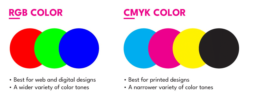
Beyond resolution, selecting the correct colour mode is essential for accurate printing. Digital screens create colours by adding light using the **RGB** model. Professional printers, however, create colours by subtracting light using ink in the **CMYK** model.
Because the range of colours possible with RGB is much wider than with CMYK, designing in RGB can lead to major disappointments.
Vibrant colours on your screen, like electric blues or neon greens, can appear dull or completely different when printed in CMYK because the printer cannot replicate them with ink.
To ensure the colours in your final printed backdrop are exactly what you and your client approved on-screen, it’s crucial that all design files are converted to the CMYK colour mode before being sent to print.
Why tension fabric display printing only require 72ppi for artwork setup?
You might wonder why artwork setup for tension fabric printing only require 72ppi.
Before we explain the reason, let’s dive in to understand the process of dye sublimation fabric printing.
Dye sublimation fabric printing involves printing a design onto special transfer paper using sublimation ink. The paper is then placed on fabric and heated to around 400°F, causing the ink to turn into gas and bond with the fabric fibers. This process infuses the design into the fabric, creating vibrant, long-lasting colors.
So you can see the artwork design was not printed on the fabric directly, it has a process pigment to gas, then to pigment on fabric.
So the tension fabric printing only needs 72ppi is good enough for printing vivid color.
Mastering print resolution and colour mode is essential for professional results. Always set your files to 300 PPI and CMYK colour to ensure your vision comes to life perfectly.